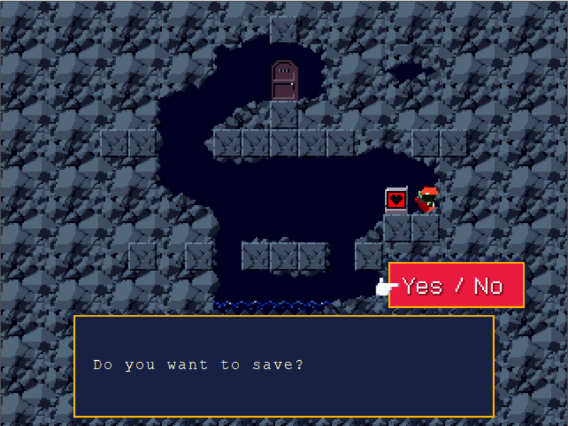
the game is 640x480 resolution. the “Yes/No” panel seem to be in the same resolution than this of the game.
But the panel displaying “Do you want to save?” seem to be at much higher resolution (such a small font at 640x480 would look blurry and illisible).
Is it possible to get this with monogame and how ?
Setting the Sampler State in spriteBatch.Begin() to SamplerState.PointClamp will probably work for the case you’re explaining, pair that with a pixel font and it should work as intended.
Thanks for your reply @SeaPeaMe but changing spriteBatch parameters don’t change anything.
It’s not possible to write the text “Do you want to save?” with that precision if the game resolution (the whole screen) is 640x480, there’s not enough pixels to get something that precise : to exagerate, let’s say you want to write the letter “a” but you only have 4 pixel to do it, you’ll see a point instead of a letter.
So I guess that this text area have a different resolution, higher than the game itself, but I don’t know how to do this or if it’s even possible with monogame.
I guess you could render the game to a small resolution and upscale it. Then draw the higher resolution textbox on top of it. This would work using render targets.
Ok, sorry I think I got lost in the resolutions: getting such precise text in 640x480 is quite possible. At this resolution, the game sprites are resized, there is a factor of 2. Which means that a sprite pixel is actually made up of 4 pixels.
Anyway, @Kwyrky and @Peewi thank you for your suggestions, absolutely correct.
This isn’t rendered at a higher resolution. @SeaPeaMe is correct. This is achieved by filtering. Probably bilinear filtering. Or subpixel rendering.
Check out ClearType to understand the concept.
Edit: looking closely, this is definitely subpixel rendering. The edges of the letters are red in parts, using only part of the RGB pixel to create the illusion of smoother text.