So this is what I’ve been working on.
I won’t be showing the actual desktop in the game (Peacenet takes place in a Unix-like operating system), but I just thought I’d at least show the main menu and Campaign startup animations/UI.
Certainly some work to be done, especially in the “making it feel like an operating system” department, but that’s a story for another time.
What do ya’s all think? 
A prealpha build of this game is set to launch between Christmas and Jan. 4th, 2018. No exact date planned.
3 Likes
Nice! I like the opacity animation, it just looks like a good fit.
Also, your music is great  Did you make it yourself?
I’m very flattered, but…no, that’s not my music. It is the music of Anders Enger Jensen, who has graciously allowed me to use some of his amazing music in the game.
1 Like
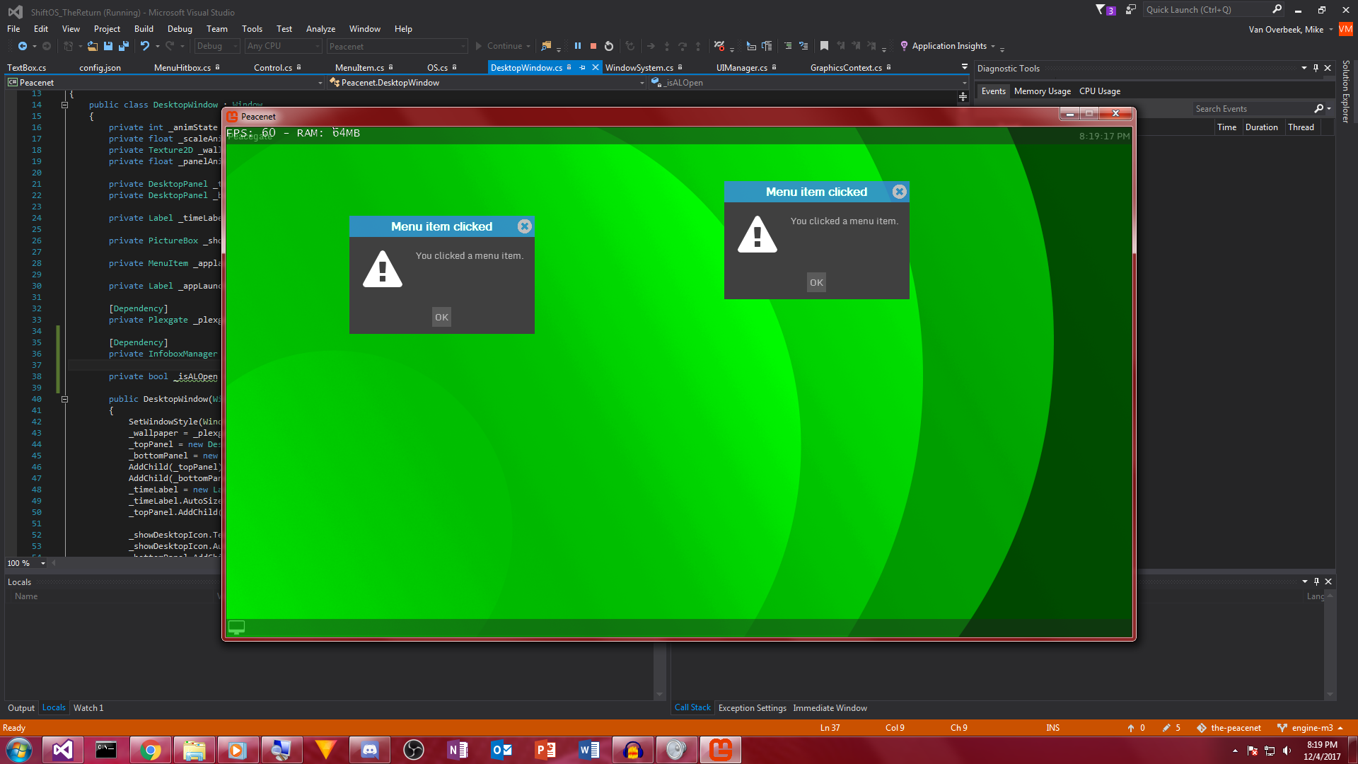
Update: Desktop user interface
So as I said earlier, this game takes place in a Unix-like operating system. Well, here’s the desktop environment of said operating system.
It’s very work-in-progress and I haven’t uploaded a demo video of it yet, but I really like it so far. It’s based off of the GNOME 2/MATE user interface with a bit of KWin thrown in with the window borders. The two panels (at the top and at the bottom) allow you to open programs, see minimal system status, and switch between windows. (Most of that hasn’t been implemented yet. Anything you click in the “Peacegate” menu just opens a “You clicked a menu item!” dialog.)
The little computer monitor icon at the left of the bottom bar is a “Show desktop” button. Much like the one in real MATE, clicking it either hides all windows or brings them back onto the screen.
Support for multiple desktops, as well as movable desktop widgets is coming, though not in the Jan 2018 prealpha.
You need to pad your buttons. Looking at those tiny ‘OK’ buttons makes me angry (the pedantic variety).
The second “Welcome to thepeacenet” image looks like it is an image, but the first looks like it could be all text rendering, it doesn’t look like you’re paying attention to baselines or descent? It feels like a ‘p’ would easily overlay the text below.
Nothing is more important the baselines of text.
Yeah, for now the “Welcome to thepeacenet” text are in fact images (“Welcome to” and “thepeacenet”).
In the Campaign intro, only “thepeacenet” is an image, while the “Previously on” text is rendered in-engine. As for padding of the buttons, way ahead of you. I’m about to add some extra padding
Update
Just for you, @AcidFaucent 
Also, that padding in the image above is actually how I had it set in the older UI engine. I like it a lot better now.

 Did you make it yourself?