Grinder - level 2 concepts

Continuing the discussion from Grinder - A post-amiga, silkworm-ish co-op game:

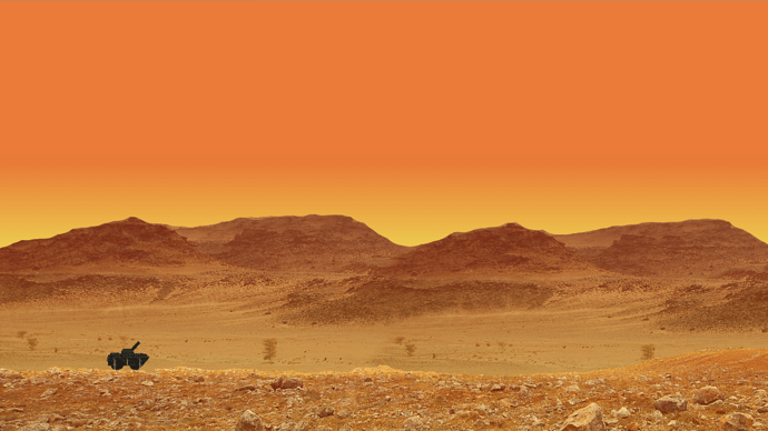
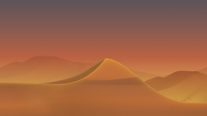
This is a screen of some concept art for level 2 of my game. -Desert sundown-assult to reach a train headed for the outer-city industrial sites (where you arrive at night, and use night vision ) … I’m SO not into doing days worth of art. That’s the real challenge for me at this time. The art grind!

I like the idea of a desert sun-down theme for the next level. I see potential.
But it takes a LOT of time to develop a technique to draw lots of terrain pieces with the same overall look.
I wont settle for manipulated photographs as these concepts…
Still, I think maybe this second one has the better colors

Tell me your thoughts on this theme…! -and let me know if you want to draw some sand dunes.

Update:


Have done some terrain profile… This is the kind of picture the computer sees for collision detection.
if the wheels of a vehicle are not in red, gravity is applied. The darker red areas are behind the player.

Uodate: Still working on drafts, trying to decide the style and construction method for terrain:

Meh… Heres some more progress with the new style… Cant say I like it too much… Baby steps, I guess…

Anyone think this stuff looks too cartoony compared to the first level…? I may scrap this in favor of something more rough and rocky… gritty… This smooth sand is,maybe, a bit bland, too clean.

Getting better… That surface highlight does a lot… All I need now is the rock formations.

Ok, I think I’m arriving at something… I had a power-out that cost me hours of work because saving is for pussies.
-But I think things are starting to look good enough for game testing…
I dont want to finalize the graphics TOO much, before getting a feel for it in-game. It has to WORK too, not just look the part…

Yeah, the ruin looks kinda funny, like a crayon or something, but I cant help using it…

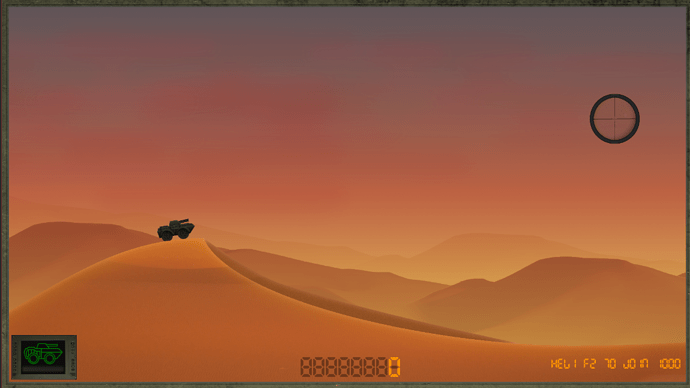
Got the first batch of graphics in the game now, everything looks pretty good I think:

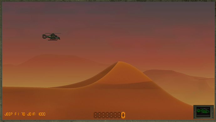
ok, just implemented per-level color controls, so I can easily tweak the lighting.
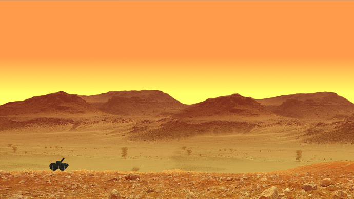
Very nice, a bit “marsish” maybe, could be great to have a deep blue sky, some (sparse white clouds) or maybe a sunrise/sunset. A cute blue/yellow-red combination can give amazing result if done well.

The tree in the “middleground” doesn’t seems to be in the right biome, they looks like more temperate climate trees. Replace them with johua trees could make the level more desolate/oppressing I guess.

Thanks! Clouds are generated dynamically in the game, this is just a mock-up in GIMP.
So the trees will go too, all this is just a flavor test made from archive photos :slight_smile:

I had also thought about mars while looking at this. -But I hope the contours and features of the real terrain will solve that.
Otherwise, some blue in the sky along with clouds might.

Got an idea: as you haven’t yet write the story, nothing prevent you to make kind of sci-fi/space war story, which could divert from the base Silkworm path (as the action take place on Earth) but can provide more challenge as gravity and environment could be quite not the player may expect to see, with huge hole and long jump on a low gravity body, unstable methane ice on one of Saturn’s satellite, etc (it would be no longer a silkwormish game but a megamix of most of the best Shoot’em up from these days).

HI!

Sounds like you have some good ideas! Unfortunately, I would probably never finish… I’m simply too slow to get all that done.
Its probably going to take a couple of weeks to finish this desert level alone…
(I need some new enemies, lots more terrain and some rocks/cliffs, a train, and a boss… code, graphics, animation and sound for each…)

But its great to hear ideas, I really appreciate someone taking the time to comment on / suggest improvements to my stuff. Thanks!

And ? Have you an emergency ? What the matter if you take 3 months to add n new levels ?
A good game is not done in a week-end alone.

At least, if you don’t have any plan to complete it (so what was the showcase for ?), release the source code, it may be helpful to some people and also allow (as long as permission is granted) others to complete it.

(Great question here: why people work so hard to learn, start creating stuff, doing great then give up just on the verge of success ? Are they afraid to win ? Or just because finishing and polishing a project is all but fun, usually ?)

he, no emergency! Its just that there are so many other things that would be cool, I have to draw the line somewhere, or I would still be working on level 1… I have to put limits on myself, or everything just expands forever.

Have you ever shared any games? I’m looking for places to put my final product… It would be cool if I could find a niche to please :slight_smile:

Have you ever tested how much performance it takes to read from the texture every frame for collision?

Yeah… that is generally really bad for performance.

I suggest at the very least only reading from the texture once during loading and building your collision information to be used during gamplay.

Still ideally you would do this during content building with a custom processor on your textures which support collision.

No I havent. But I am working on improving this system. It works, but its too demanding for real-time games with lots of actors/bullets…

It seems to be bad for performance (have been using 1920x1080 images), at least when you have lots of calls, so I am thinking of solutions…

I have been considering using a huge pre-generated 2d array for the entire level, or sub-deviding my terrain into smaller textures… I have created a post on this topic earlier today, if would care to read it and offer some thoughts, that would be great!

Hey, its been a while, but just wanted to mention that putting the textures into an array instead, is much faster… So I have implemented that method in my game instead.