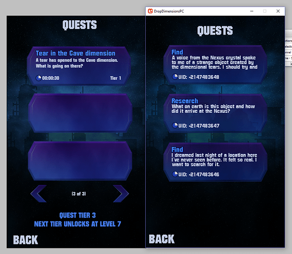
I’ve been working on some of the menus for my game and hit a common issue for me in that fonts do not look correct/clear to me, especially versus my mock ups in photoshop using the same fonts. I’m uploading a screenshot of my game window against my mockup so you can see what I mean. Is there anything I can do about this?
during the png save and/or the upload the image has softened the fonts in game with compression but you can still see the jaggies - its just more pronounced raw in game! 
Which version of MonoGame are you using? The latest develop version has had a much better font texture processing for a while now.
easy things to check that might influence the font quality:
-
When beginning the spritebatch, check that you’re using SamplerState.LinearClamp (or LinearWrap)
-
In the content builder, check that you’re importing the font with “Color” texture format (never use compression for fonts, although looking at the screenshots it seems they’re already with “color”)
if I select Monogame.Framework in the references section of my project it says its loading it from the Monogame\v3.0\ directory, the runtime version reports as v4.0.30319 and the Version reports as 3.6.0.1625. Is the latest dev version stable? And could I take advantage of better font processing just by using the latest content management tool or will I need to update the whole framework?
Thanks for these KakCAT, my fonts WERE compressed! I’ve set them all to Color and also set the sampler state as you suggested. Things look a LITTLE better but certain letters (especially lowercase s’) are still being mangled 
The improved font texture processing is a specialized DXT3 compressor written for SpriteFont that allows the font texture to be compressed but does not suffer any blocky artifacts usually associated with texture compression. Unfortunately you cannot just cherry-pick that one improvement.
We use FreeType to rasterize the font glyphs. It is usually a high quality rasterizer, but it also depends on the quality of the font being imported. I do not know how PhotoShop rasterizes its font glyphs, but its likely to be a complex, expensive and proprietary process.
Are you rendering the font at a scale of 1.0? The FreeType rasterizer may not be able to rasterize the fine detail in glyphs such as the lowercase ‘s’, especially if the font does not include hinting for small point sizes.
There are better font rendering methods, such as signed distance field, but these require larger changes to work properly (specialized shaders, etc), that I would like to add support for, but these won’t happen for a little while yet.
